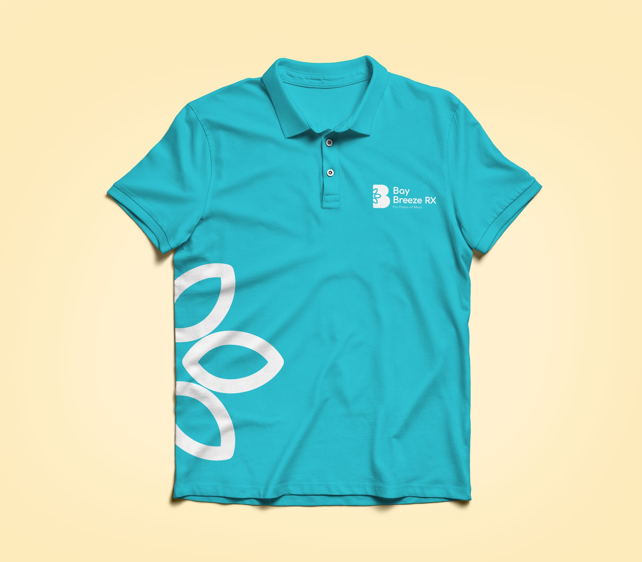
Bay Breeze RX: A local family pharmacy
Logo redesign, Branding, Stationery Design, Web Design
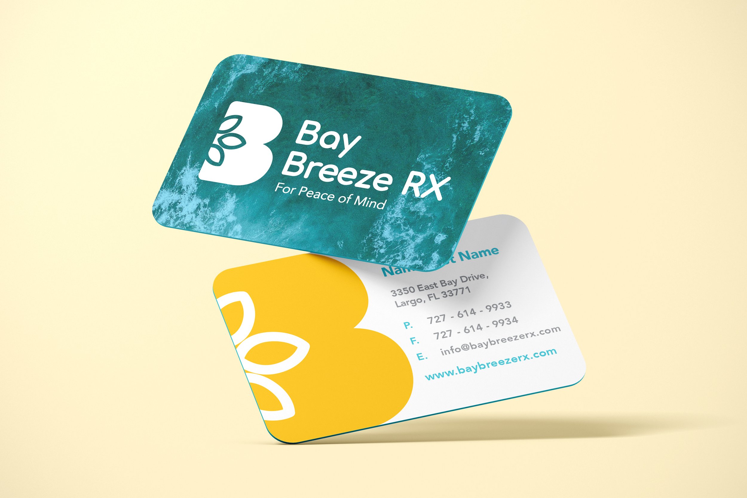
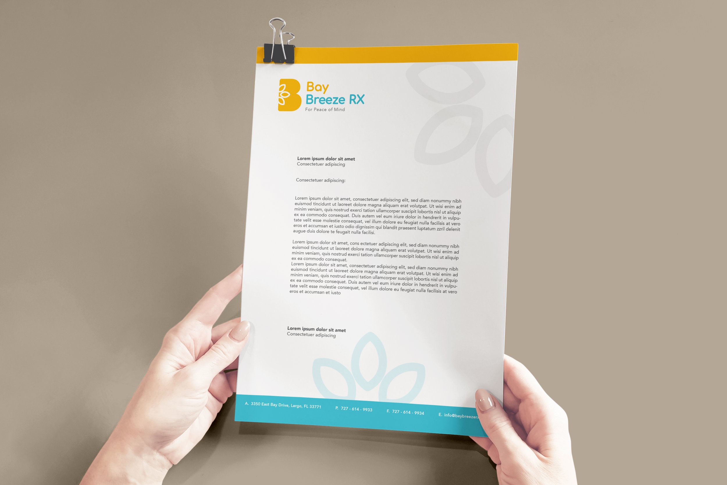
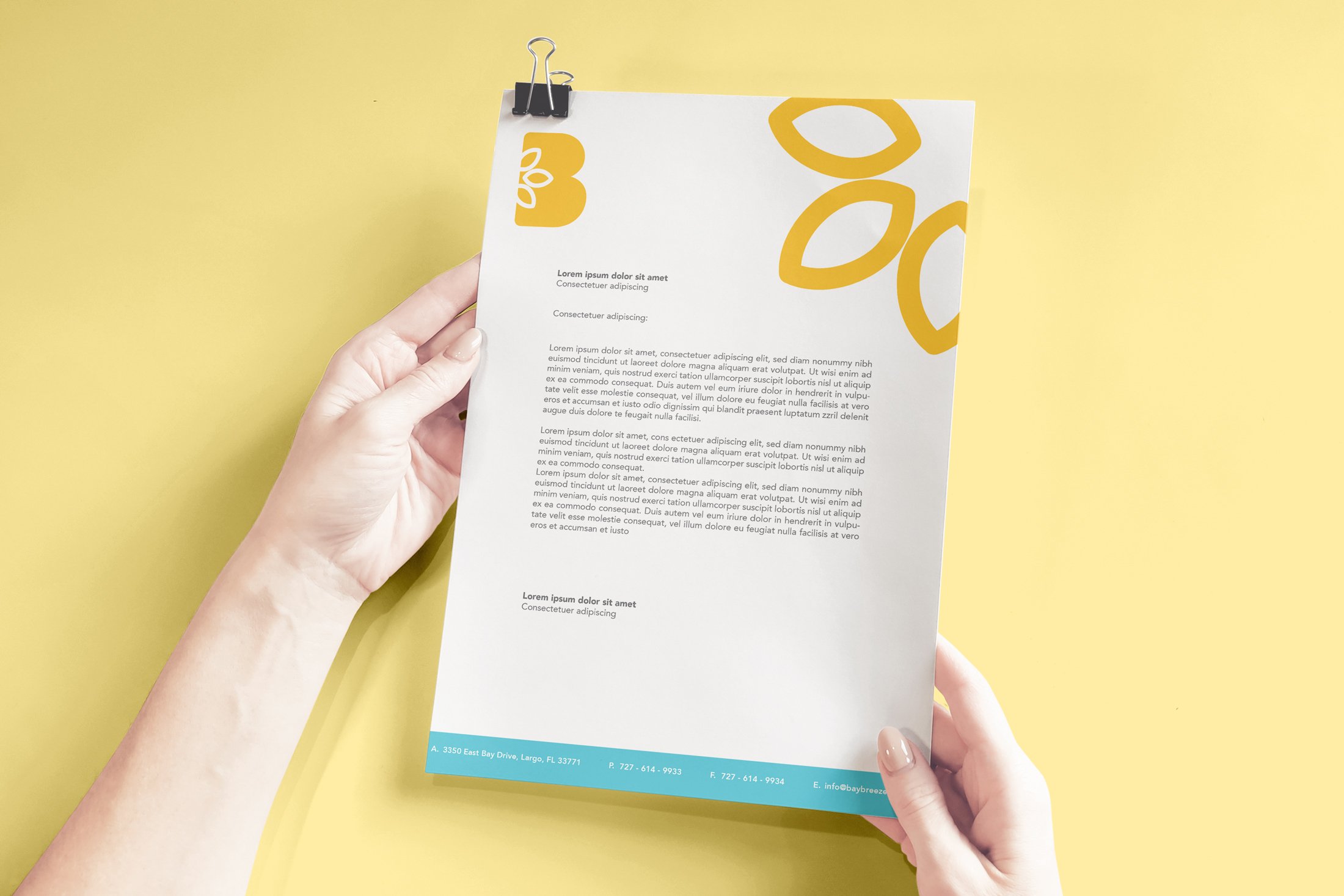
While forming part of the amazing creative team at System Soft Technologies, Bay Breeze was one of the first projects assigned for me to lead. In collaboration with the Art Director, we created several logo options, and this was the final version selected by the client. We implemented 3 lotus flower petals inside the iconographic “B” to communicate the three values we felt that symbolized the Bay Breeze RX brand; wellness, health and family centered service to its community. A round sans-serif typeface was used to also help the brand demonstrate a friendly and inviting tone while also giving a minimalist look and feel.
