Grown in Puerto Rico is not the same as “Made In Puerto Rico”.
It all begins with an idea. Maybe you want to launch a business. Maybe you want to turn a hobby into something more. The founders of Café Catalina had that hunch for a while, and they asked for my help with their branding to start making this family long dream come true.
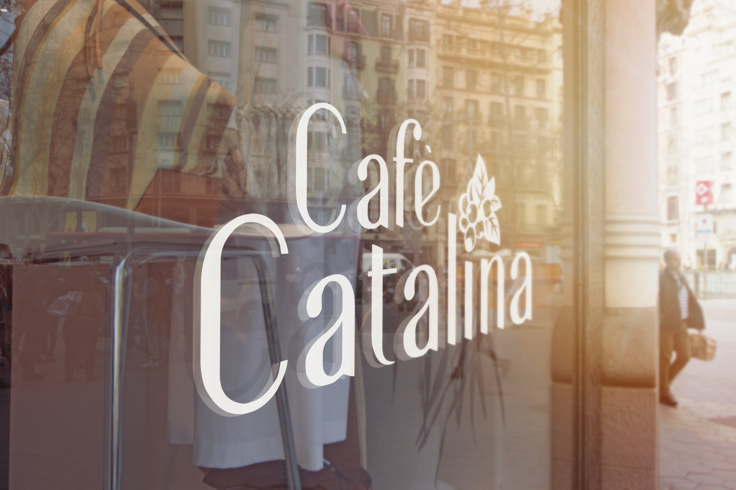
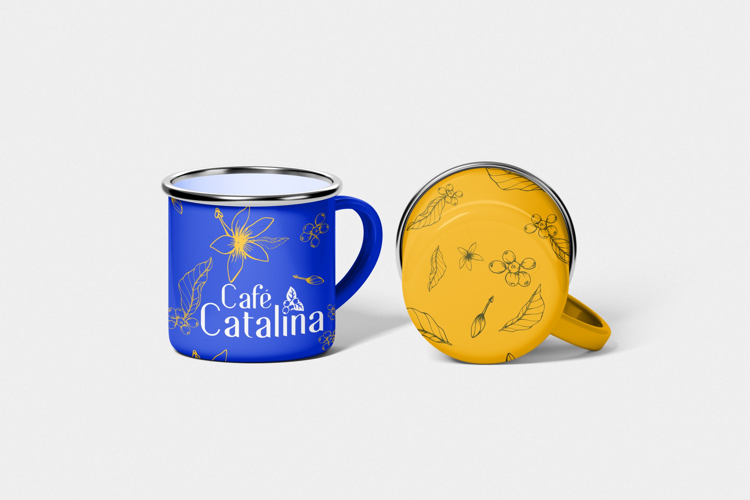
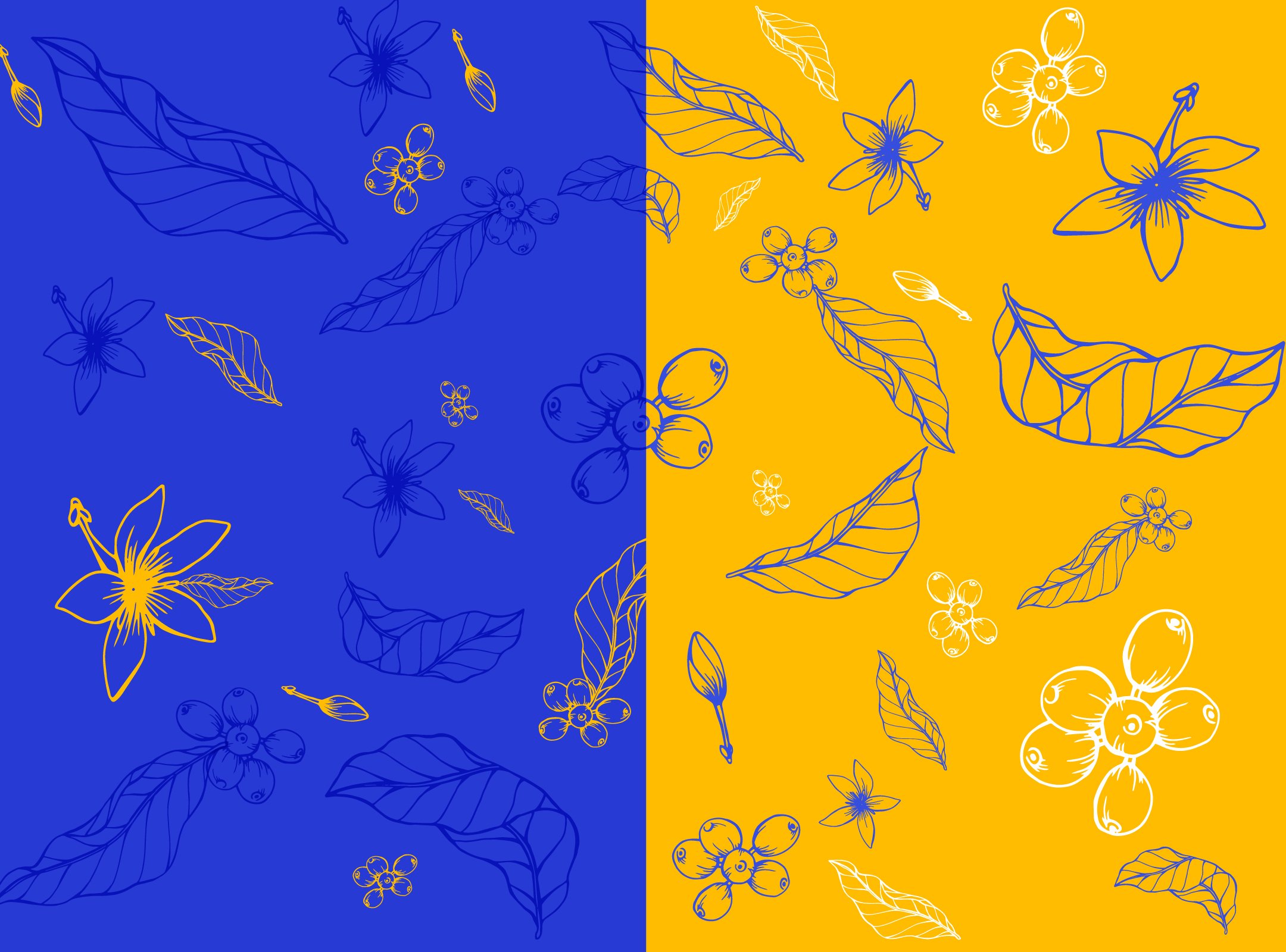
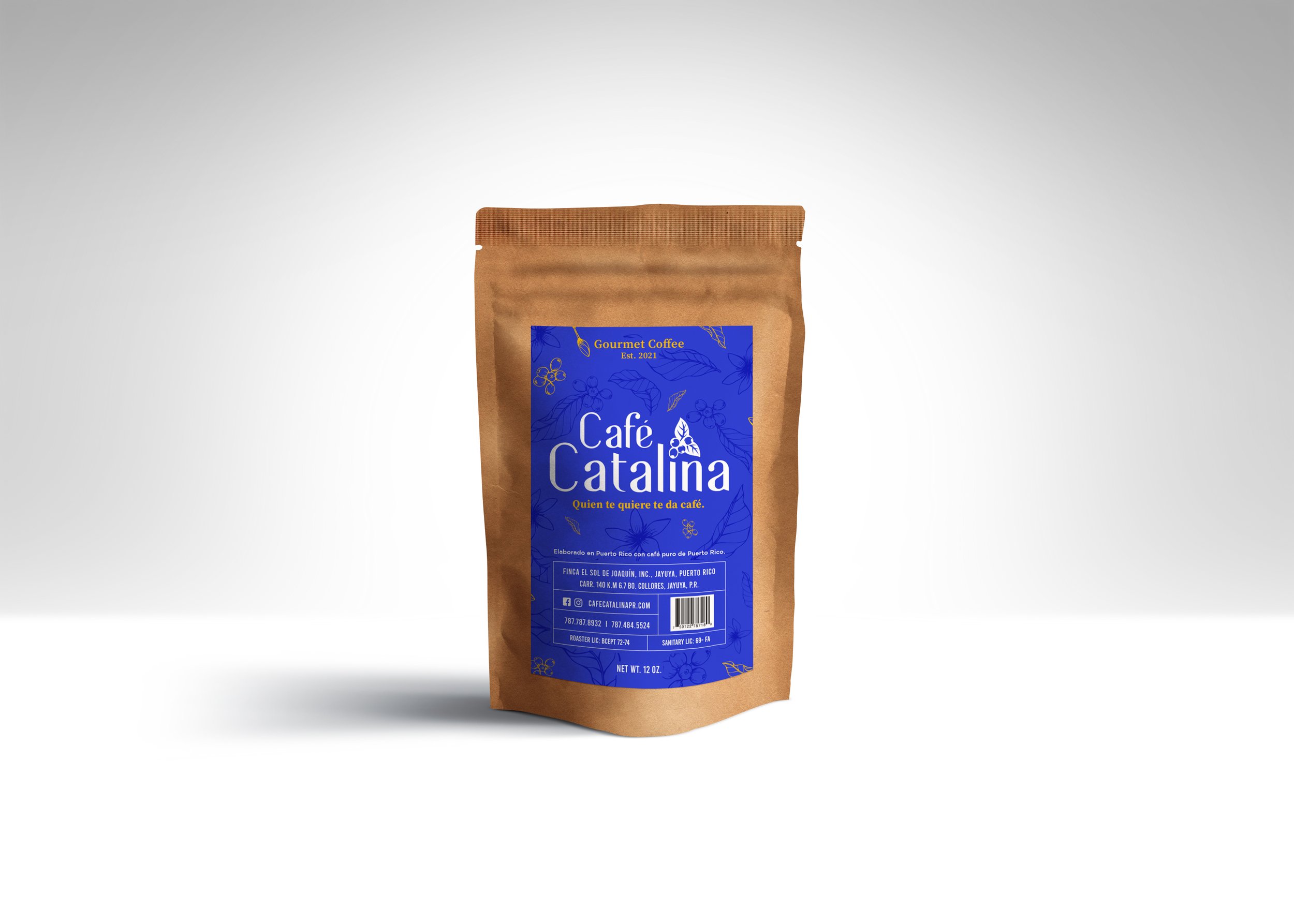
This logo is all about standing out. It portraits minimalism and boldness with and elegeant look and feel. The font used is called Bentalista, an incredibly elegant and modern sans serif font. It is very adept for both formal and informal styles of designs. I’ve used a very different color pallete as to what the coffee industry is acustommed to. Blue isseen as elegant, rich, sophisticated, most times representing superiority. Yellow to represent freshness and loyalty, and pink for a touch of femininity that represents Catalina.


